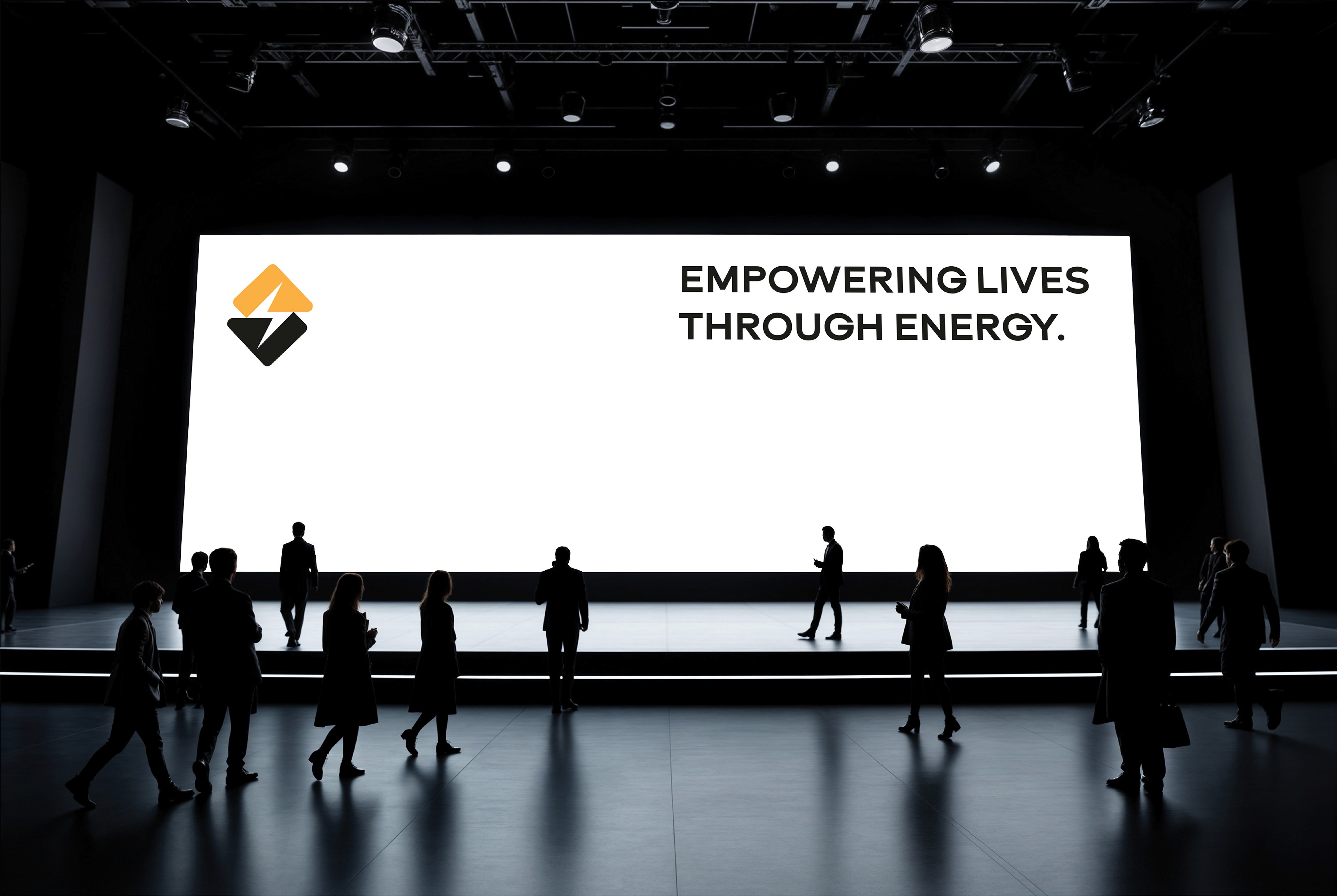
Big Energy is a comprehensive corporate brand identity project developed for a modern energy supplier. The design centers on a minimalist, high-impact emblem that creates a crisp lightning bolt using the negative space between two interlocking, angled chevrons. This dual-colored mark utilizes a vibrant yellow-orange tone to symbolize dynamic power and innovation, paired with a solid dark block to represent grid stability, safety, and institutional trust. The visual layout ensures seamless scalability across large-scale physical utility assets, corporate stationery, and digital customer platforms by maintaining clean, geometric typography and a high-contrast corporate presentation.